Understanding the Basics of Charts and Graphs in Excel
By now, most of us know that Excel isn’t just a glorified calculator. It’s a powerful tool for data analysis, reporting, and visualization. In my experience, one of the best ways to make your data pop is by using charts and graphs. They can transform a table of numbers into something visually engaging, making it easier for stakeholders to grasp key insights at a glance.
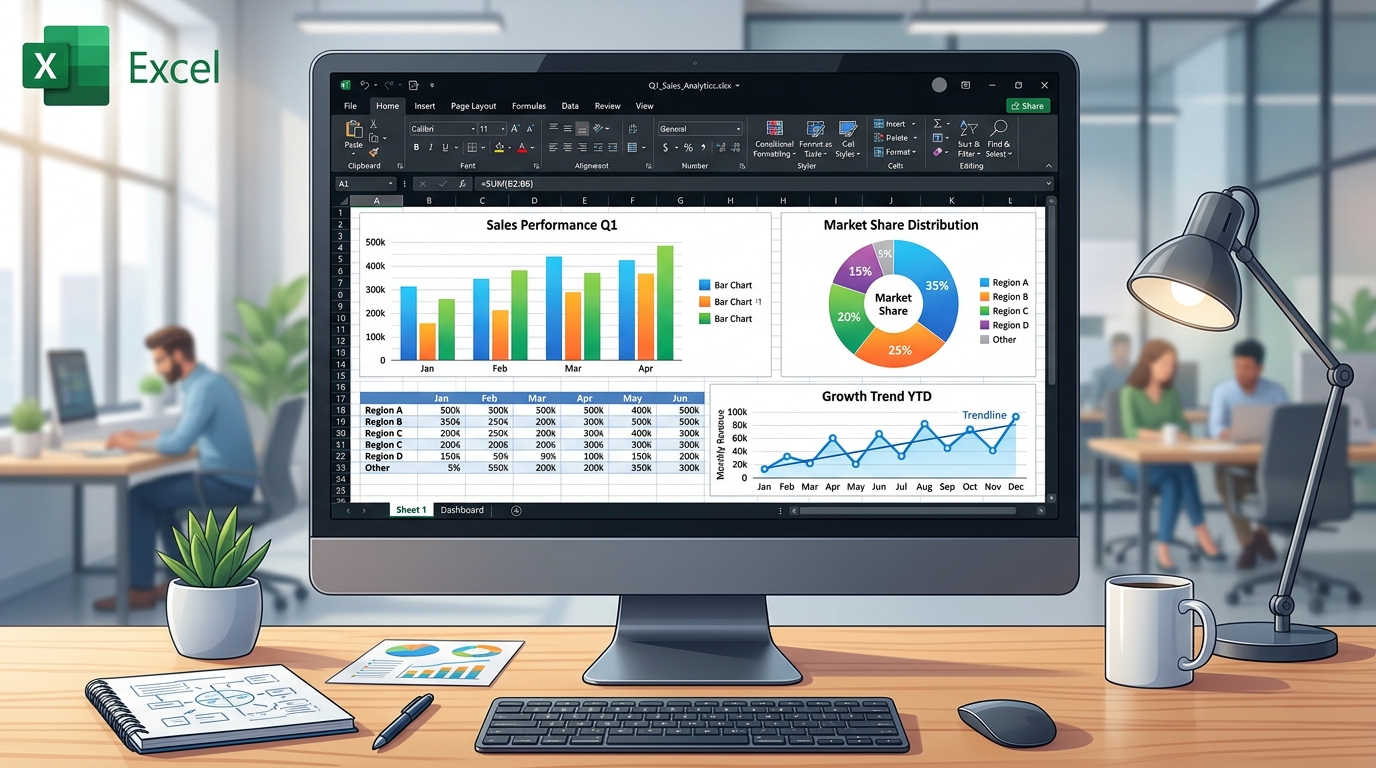
Whether you're a seasoned analyst or just getting your feet wet with Excel, learning to create effective charts is a skill that pays dividends. Let’s dive into how to create various types of charts in Excel, focusing on the versions you’re most likely using: Excel 365, Excel 2021, Excel 2019, and Excel for Mac.
Preparing Your Data
Before you even think about making a chart, it’s crucial to organize your data correctly. If you’re dealing with sales data, for example, you might have columns for dates, product names, and units sold. Here’s a quick layout:
| Date | Product | Units Sold |
|---|---|---|
| 1/1/2023 | Product A | 150 |
| 1/2/2023 | Product B | 200 |
| 1/3/2023 | Product A | 120 |
Once your data is organized, highlight the relevant cells. For Excel 365 and 2021 users, this means selecting your data range and navigating to the Insert tab. Just a friendly reminder: be cautious with empty rows and columns; they can confuse Excel and lead to incomplete or incorrect charts. I’ve had my fair share of confusion over the years because of that!
Creating Your First Chart
To create a chart, you don’t need to be a data wizard. Just follow these steps:
- Select your data range.
- Go to the Insert tab in the ribbon.
- Choose the type of chart you want—Excel offers bar, line, pie, and more.
In Excel 2019, this feature is quite similar, but you may find a slight difference in the layout of the ribbon. Once you’ve selected your chart type, Excel will generate a default chart that you can customize based on your needs.
Customizing Your Chart
Alright, so you’ve got your chart created. Now what? Making it look professional and tailored to your needs is key. Here are a few customization tips:
- Chart Title: Click on the default title and type something more descriptive, like “January Sales Performance.”
- Data Labels: Right-click on data points to add data labels. Trust me, showing exact sales figures can make a huge difference.
- Chart Styles: Explore the Chart Styles section to apply different visual formats. In Excel 365, you’ve got a plethora of styles that can quickly enhance readability.
Dica DomineTec: Don’t overdo it with colors and effects. Simple, clean charts are often the most effective!
Types of Charts: Which One to Use?
Choosing the right type of chart can feel overwhelming, but it’s all about the kind of data you have and the insights you want to showcase. Here’s a quick rundown:
| Chart Type | Best For | Example |
|---|---|---|
| Line Chart | Trend over time | Monthly sales growth |
| Bar Chart | Comparing values | Sales by product |
| Pie Chart | Part of a whole | Market share |
No Excel 2019, the chart types are laid out quite clearly. Just remember, while pie charts can be visually appealing, they often lead to misinterpretation if there are too many categories involved. Trust me; I’ve witnessed plenty of meetings where confusion reigned supreme over a pie chart!
Working with Advanced Chart Features
Now that you've mastered the basics, let’s level up your chart game with some advanced features that can really impress your audience. For instance, did you know you can use Combo Charts in Excel? They allow you to combine different chart types, which is perfect for showing sales and profit margins on the same graph. Here’s how:
- Select your chart.
- Navigate to the Chart Design tab.
- Click on Change Chart Type.
- Choose the Combo chart option.
This feature is particularly handy in Excel 2021 and 365, where customization options are more robust. Take the time to play around with these features—they can help you convey your message more effectively.
Exporting and Sharing Your Charts
Once you’ve created and customized your charts, the next step is sharing them with your team or stakeholders. Whether you’re thinking of embedding a chart in a report or simply saving it for an email, here are some options:
- Copy and Paste: This is the simplest method. Simply copy your chart (Ctrl+C) and then paste it wherever you need (Ctrl+V).
- Export as Image: Right-click the chart, select Save as Picture, and choose your desired format. This is handy for presentations.
- Linking to Reports: If you’re generating financial reports regularly, consider linking your Excel charts to your reports so they update automatically with changes.
However, a word of caution: make sure the data is accurate before sharing. I once shared a report with a glaring error, and let me tell you, that was an awkward Monday morning!
Common Mistakes and Troubleshooting
Even seasoned Excel users make mistakes, so don’t feel bad if you hit a snag. Here are some common pitfalls and how to avoid them:
- Inaccurate Data Selection: Double-check your data range. You don’t want to create a graph based on incomplete data.
- Overloading Information: Too much information can overwhelm your audience. Stick to key insights.
- Neglecting Updates: If your data changes, your chart should too! Always refresh your charts after updating data.
When in doubt, refer back to your original data and start fresh. Sometimes, it’s easier to wipe the slate clean than to fix a messy chart!
Mastering Dependent Drop-Down Lists (The Pro's Secret)
Remember that time you needed to pick a State and then only the Cities from that state should appear? Yeah, me too. I wasted hours trying to hack this in Excel 2019 until I discovered the true power of the =INDIRECT() function. If you want to impress your boss on a financial report or HR dashboard, creating dependent drop-down lists is the way. Basically, you name a range of cells (select it and hit Ctrl+F3 to open the Name Manager) and use data validation to call that name.
The trick here is to use the Data Validation feature (quick shortcut: Alt, A, V, V) and, in the Source field, type something like =INDIRECT(A2). When I built an inventory management tracker last week, this reduced typing errors to zero. Seriously, zero! In Excel 365, with dynamic arrays, it got even easier. You can use the =FILTER() function alongside =UNIQUE() to create self-updating lists. Something like =UNIQUE(FILTER(B:B, A:A=D2)). This is real life, folks, no fluff.
=SUBSTITUTE(A2," ","_") if you have to!Formatting Cells Based on Selection (Conditional Formatting)
Having a list isn't enough; it needs to pop. How many times have you stared at a dull, gray spreadsheet? I personally love using Conditional Formatting to highlight a user's choice. Say you select "Completed" from a drop-down. Boom, the whole row turns green. Awesome, right? In Excel Online and Excel for Mac, this works wonderfully too.
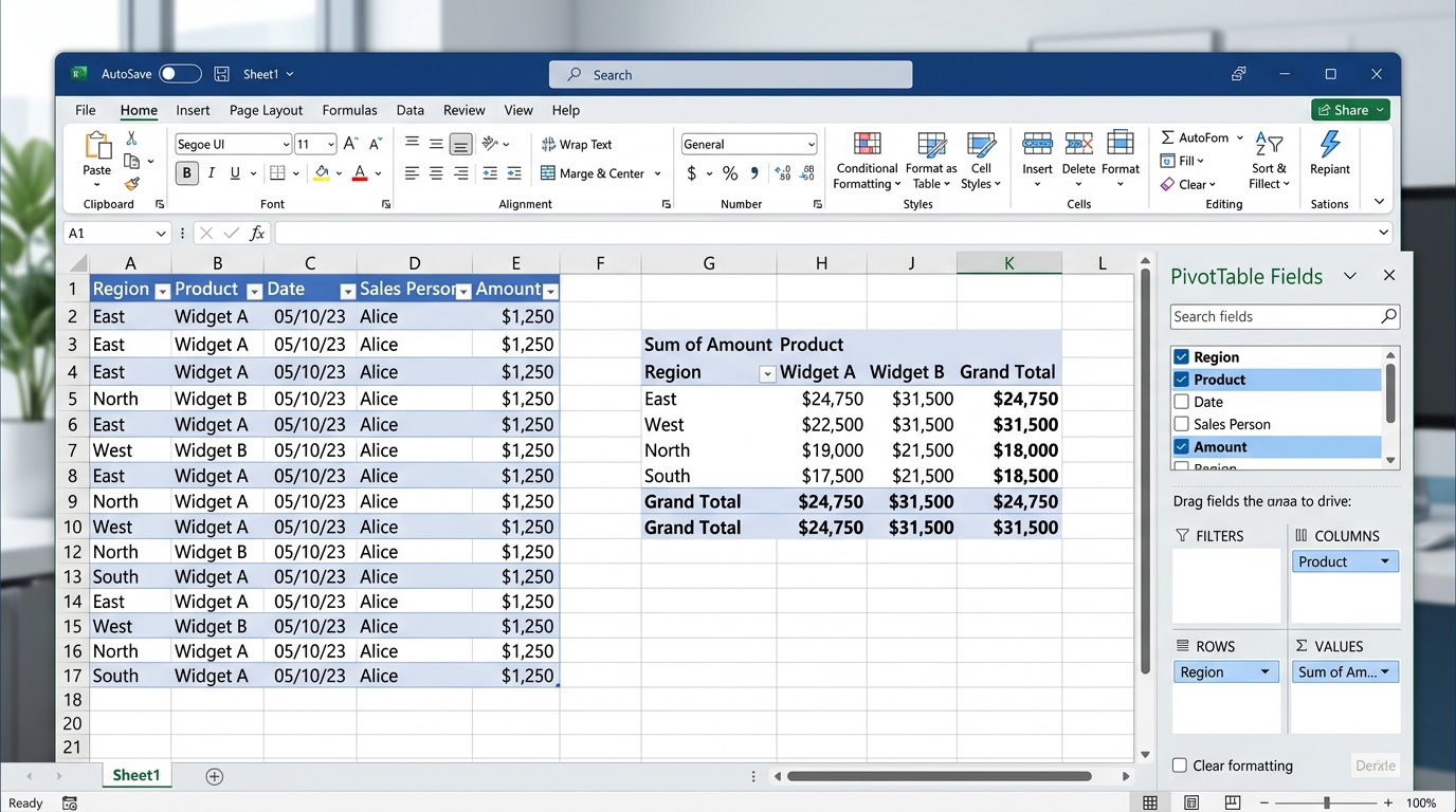
To do this, select your data (use Ctrl+Shift+L to toggle filters first if you like), go to Conditional Formatting > New Rule, and choose "Use a formula to determine which cells to format". The formula will look like =$C2="Completed". Remember the dollar sign ($) to lock the column, hitting F4 a couple of times. I've literally seen sales managers applaud when a sales pipeline magically changes color. It’s the little details that separate the rookies from the Excel ninjas.
Troubleshooting Common Issues: The Ghost of the Blank List
You know what's frustrating? You click the little arrow on your list and... nothing. Just blank space. I've been there too many times, especially working with shared workbooks in Excel 365. Usually, this happens because the source range has empty cells at the bottom, or you forgot to check the "Ignore blank" box in the validation window.
Another classic issue is when users copy and paste (the infamous Ctrl+C, Ctrl+V) data from elsewhere, completely wiping out your data validation rules. Trust me, I almost cried when a coworker destroyed months of data validation doing exactly that. The fix? Protect the sheet! Go to the Review tab and click Protect Sheet. Allow users to only select unlocked cells. To avoid massive headaches, I sometimes use a quick Alt+F11 macro to block paste-special actions (though that's a topic for an advanced post).
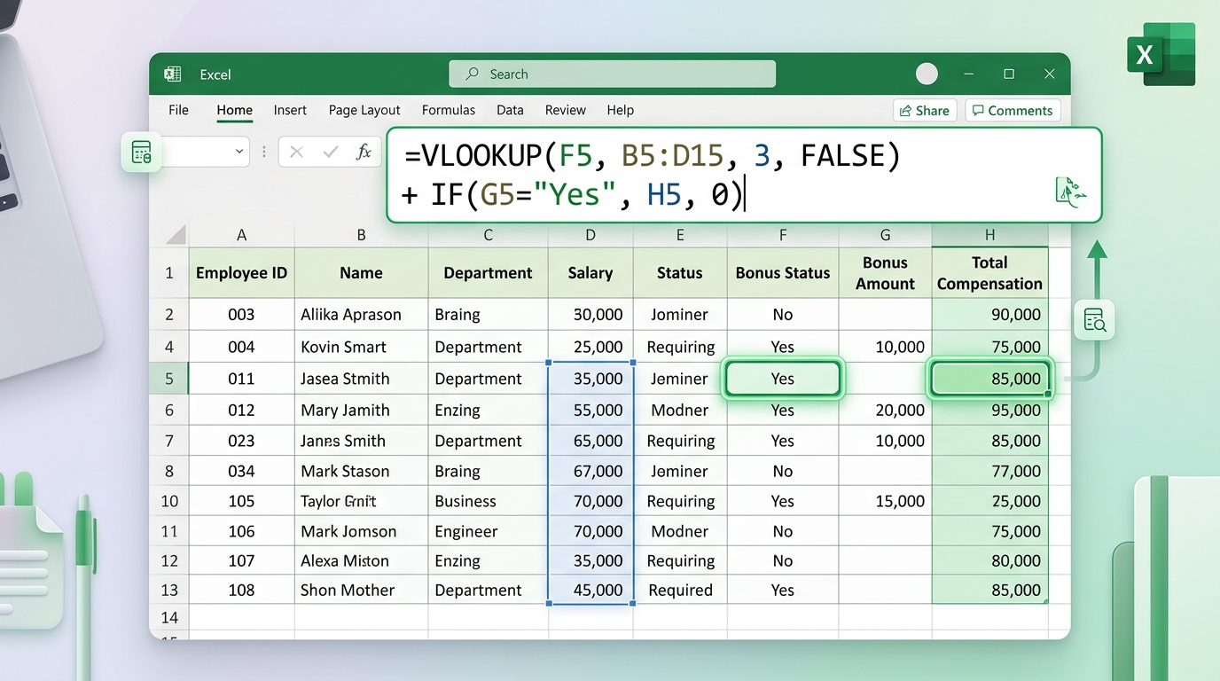
If you're using a =VLOOKUP(A2,Sheet2!$A:$D,3,FALSE) based on a list choice and it returns #N/A, check for trailing spaces. The =TRIM() function is your best friend here!
Dynamic Arrays and Lists: The Future is Here
If you're running Excel 365 or Excel 2021, listen up, because this changed my life. Dynamic arrays allowed us to ditch a lot of messy workarounds. Back in the day, to get a drop-down list without duplicates, we needed brain-melting array formulas. Today? Just type =UNIQUE(A2:A100) in a scratch cell, and in your Data Validation, reference that cell by adding a hashtag at the end, like =$G$2#.
The hashtag (or spill operator) tells Excel to grab the entire spilled range. I used this on a fleet tracking spreadsheet last month. Whenever a new driver was added to the table (always use tables, Ctrl+T is life!), the drop-down list on another tab updated instantly, no reference tweaking needed. It's the kind of efficiency that saves hours of grunt work and gives you more time for coffee. If you try this in Excel 2019, it'll error out, so mind your version.
Ninja Tips for Shortcuts and Productivity
I wouldn't be a true Excel nerd if I didn't talk about keyboard shortcuts. Productivity is everything. Want to open a drop-down list without touching the mouse? Navigate to the cell and press Alt + Down Arrow. Wham! The list opens. It might sound trivial, but when you're filling out 200 rows of an accounting report, it saves your wrists.
And if you mess up? Good old Ctrl+Z undoes the last action. Need to repeat the formatting you just applied to a list? Press F4. F4 repeats your last command (besides locking cells in formulas). Combining these small actions turns you into a maestro, conducting a symphony of cells. I've seen analysts who took all day to close a P&L cut their time in half just by abandoning the mouse. Try it!
Frequently Asked Questions
Can I create a chart without selecting data first?
While it's not typical, you can create a blank chart and then add data afterward. In the Insert tab, select the chart type, and then use Chart Design > Select Data to choose your data afterward. Just keep in mind that starting with data is much simpler.
What’s the difference between 2D and 3D charts?
2D charts provide a straightforward representation of your data, making it easier for comparisons. 3D charts can be more visually appealing but are often harder to read. In my experience, stick with 2D for clarity unless you’re aiming for a specific visual effect.
How do I edit the data labels on my chart?
To edit data labels, click on the chart, then click the data labels you wish to change. You can add or remove data labels by right-clicking and selecting Add Data Labels or Remove Data Labels. If you want them formatted differently, explore the formatting options in the right-click menu.
Can I use charts in Excel for Mac?
Absolutely! The process is quite similar on Excel for Mac. However, you may find slight differences in the ribbon layout. The same principle of selecting data, navigating to the Insert tab, and choosing a chart type applies.
What’s the best chart for displaying sales data over time?
A line chart is often best for showing trends over time. It helps visualize how sales have changed month by month. If you’re looking to compare multiple products or categories, you might also consider a grouped bar chart.