What is a Pivot Table and Why Use It?
If you've ever found yourself sifting through rows and rows of data in Excel, you know it can feel like looking for a needle in a haystack. That's where Pivot Tables come in. They are powerful tools that allow you to summarize and analyze large sets of data quickly and effectively. Whether you're tracking sales, managing inventory, or creating financial reports, Pivot Tables can save you a ton of time and frustration. In my experience, once you get the hang of them, you’ll wonder how you ever managed without them!
Getting Started: Preparing Your Data
Before diving into the mechanics of creating a Pivot Table, it's essential to ensure your data is organized correctly. Here are a few golden rules I follow:
- No blank rows or columns: Ensure your data is in a continuous range.
- Headers are critical: Each column should have a unique header to make sense of the data.
- Consistent data types: For example, if you're logging sales figures, ensure all entries in that column are numeric.
After you have your data in order, select any cell within your dataset to get started. Here's a little shortcut: Ctrl + T will convert your data into a table, which is super handy for Pivot Tables!
Creating Your First Pivot Table
Now for the fun part! Creating your first Pivot Table in Excel is relatively straightforward. In Excel 365, here’s how to do it:
- Go to the Insert tab on the ribbon.
- Click on PivotTable.
- In the dialog that opens, ensure your table/range is correct.
- Choose whether you want the Pivot Table in a new worksheet or the existing one.
- Click OK and voila! Your blank Pivot Table is ready for customization.
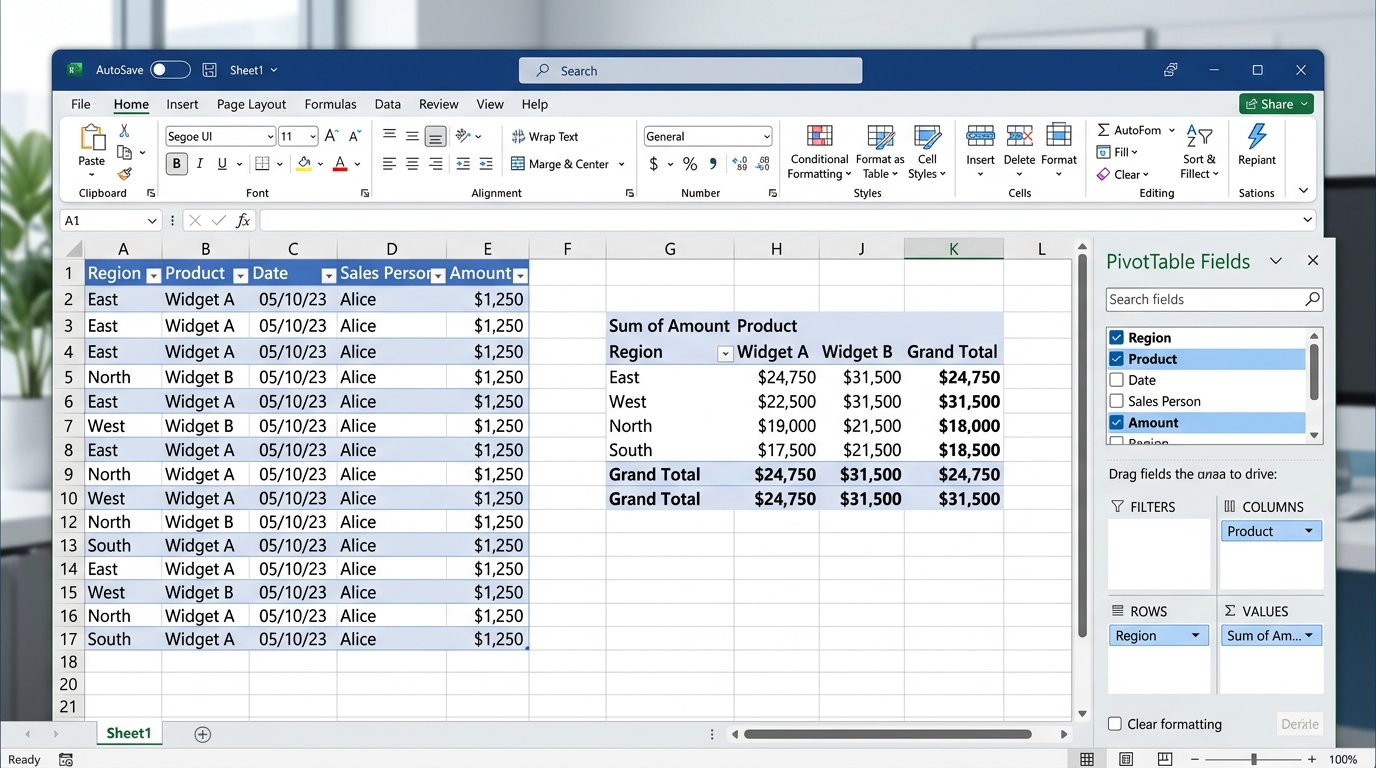
You’ll now see a new tab with the PivotTable Fields on the right side. This is where the magic happens! You can drag fields into the "Rows," "Columns," "Values," and "Filters" areas to structure your data as you wish.
Customizing Your Pivot Table
Once you have your basic Pivot Table, it’s time to customize it to fit your needs. Here’s where you can have some real fun. Let's say you're working on monthly sales data. You might have columns for Product, Sales Amount, and Salesperson. Here’s how you can slice it up:
- Drag Product into the Rows area.
- Drag Sales Amount into the Values area.
- Optionally, drag Salesperson into the Columns area.
Your Pivot Table will now show total sales by product, and if you included salesperson, you can even see who sold what! Talk about making data work for you.
Using Calculated Fields in Pivot Tables
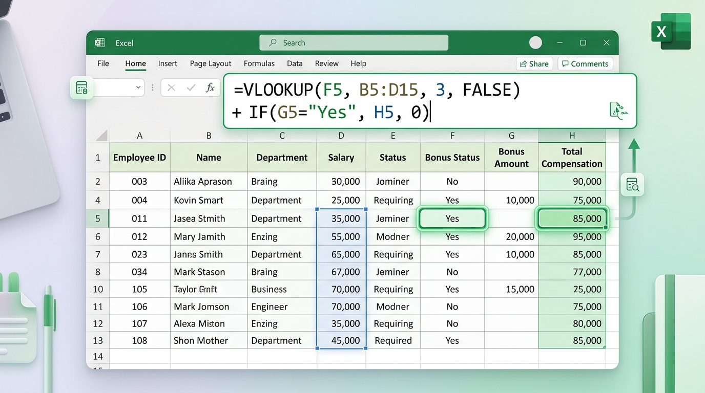
One of the coolest features of Pivot Tables is the ability to add calculated fields. This is a godsend when you need to perform additional calculations on your data without messing up your initial dataset. For instance, let’s say you want to calculate the average sale per product. Here's how you can do it:
- Click on the Pivot Table, then go to the Analyze tab.
- Select Fields, Items & Sets.
- Choose Calculated Field.
- Give it a name like “Average Sale” and for the formula, enter something like
=Sales Amount / COUNT(Sales Amount). - Click Add and then OK.
And just like that, you have a new field showing the average sales! Na minha experiência, calculated fields can sometimes cause confusion, so just be cautious with your formulas.
Refreshing Your Pivot Table
One common mistake users make is forgetting to refresh their Pivot Tables after making changes to the underlying data. Trust me, I've been there—spending hours analyzing data only to realize I was looking at outdated figures. Whenever you update your dataset, just hit Ctrl + Alt + F5 to refresh your Pivot Table. In Excel 2021, this is especially important since the program may not auto-refresh as often as you’d like.
Dica DomineTec: Always double-check your data sources. A simple misreference can lead to hours of troubleshooting!
Visualizing Your Pivot Table Data
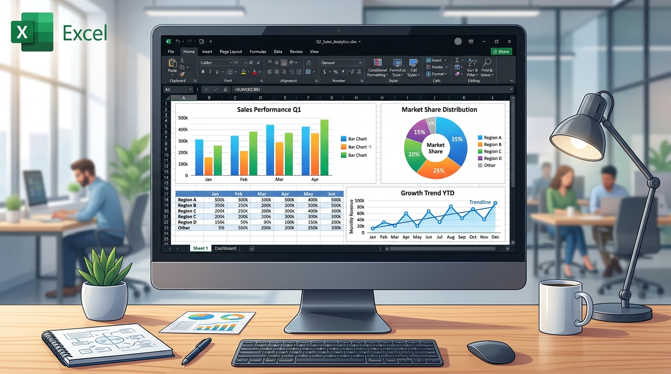
Now that you have a beautifully organized Pivot Table, why not bring those numbers to life with some visuals? Excel offers a variety of chart types that can be linked directly to your Pivot Table. Here’s how to create a chart:
- Click anywhere in your Pivot Table.
- Go to the Insert tab.
- Choose your desired chart type, such as a bar or line chart.
Excel will automatically generate a chart reflecting the data in your Pivot Table. This is particularly useful for presentations or reports to visually demonstrate trends and insights. Just keep in mind that the chart settings can sometimes reset—so always double-check after refreshing your data!
Common Pitfalls and How to Avoid Them
No one is perfect, especially when it comes to navigating the labyrinth of Excel functions! Here are some pitfalls I've seen people fall into when creating Pivot Tables:
- Wrong data type: Ensure numbers are formatted as numbers and dates as dates, or you might end up with unexpected results.
- Ignoring Grand Totals: It’s easy to overlook these, but they can provide crucial context to your data.
- Overcomplicating the fields: It’s often better to start simple and then layer on complexity. It’s easy to get lost in the data jungle.
By keeping it straightforward and updating your skills, you'll make your life a lot easier.
Structuring Your Data Before Inserting a Pivot Table
Do you know that feeling when you create a Pivot Table and the numbers just don't add up, or weird blanks appear out of nowhere? Most of the time, the culprit isn't a glitch in Excel 365 or Excel 2021; it's how your raw data is structured. For Pivot Tables to perform their magic, your data needs to be in a perfect tabular format.
What does this mean practically? First off, forget about those beautiful merged cells you love to use for formatting. Excel despises merged cells when it comes to summarizing data. Every single column must have a unique, clear header in the first row. No blank rows or columns should exist in the middle of your dataset. If you hit Ctrl+Shift+L to activate filters and notice that some rows were left out, it's a huge red flag that your dataset has gaps.

Here is a life-saving tip: before clicking on insert Pivot Table, turn your raw data into an Official Excel Table. Just click anywhere inside your data and press Ctrl+T. Why is this so crucial? Because if tomorrow you paste 500 new rows at the bottom of your sales report, the Pivot Table will automatically include these new rows as soon as you hit Alt+F5 (the holy grail shortcut for refreshing data). No more manually adjusting the data range every single Friday!
Grouping Dates and Numbers Like a Data Analyst
I've seen plenty of people create extra columns with complex formulas just to extract the month or year from a date. Trust me, you don't need to do any of that. Pivot Tables are incredibly smart when dealing with dates, especially in Excel 2019 and newer versions.
If you drag a date column into the Rows area, Excel will automatically attempt to group everything by Years, Quarters, and Months. But what if you want to view the data on a weekly basis? It's a breeze: right-click on any date inside the Pivot Table and choose Group. In the dialog box that pops up, deselect Months, click on "Days", and change the "Number of days" to 7. Boom! Your HR or inventory management report is now perfectly segmented by weeks.
Just beware of one detail: if there is even a SINGLE cell in your original date column that contains text instead of a valid date (like a random space), Excel panics and greys out the Grouping option. If the option is disabled, go back to your source data, apply a filter, and hunt down the intruder.
Using Slicers for Interactive Dashboards
Slicers are arguably one of Microsoft's best inventions. They are, essentially, filters dressed up in an elegant, clickable button interface, transforming a boring spreadsheet into an interactive dashboard. Whether you are using Excel for Mac or Windows, this feature is spectacular.
To add one, click anywhere inside your Pivot Table, go to the "PivotTable Analyze" tab, and click "Insert Slicer". Let's say you choose the "Region" column. Instantly, a sleek box appears with buttons for each region. Now comes the masterstroke that few people utilize: you can connect this single Slicer to multiple Pivot Tables at the same time!
Right-click the Slicer and select "Report Connections". Check the boxes for all the Pivot Tables that make up your dashboard. Now, when you click on "North America", all the charts and tables on your screen will update simultaneously to reflect only that region. It's the kind of trick that makes you look like a data wizard in meetings, even though it literally took you three clicks to set up.
Calculated Fields: Keeping the Source Data Clean
A classic mistake: you have "Revenue" and "Cost" columns in your dataset, so you create a third column in the raw data using =Revenue-Cost to find the Profit. Does it work? Yes. But it makes your file heavier and less flexible. Pivot Tables handle this internally with mastery using Calculated Fields.
While inside the Pivot Table, go to "Fields, Items, & Sets" and choose "Calculated Field". Name it "Profit" and in the formula bar, type = Revenue - Cost. Excel will now calculate this at the summary level, not row by row. This means no matter how you pivot the data, the calculation remains accurate and scales correctly.
This is absolutely vital when dealing with percentage margins. If you calculate the profit margin row by row in the source data and then ask the Pivot Table to average those margins, the math will be bizarre (the average of averages is fundamentally flawed). By creating a calculated field = Profit / Revenue directly in the Pivot Table, Excel totals the raw amounts first and ONLY THEN performs the division. Absolute precision.
Pro Tips and Shortcuts for Excel 365 and Beyond
After years of wrestling with financial reports, I’ve collected shortcuts and quirks that speed up my workflow immensely. Here are my favorites for anyone using modern versions, including Excel Online:
- Refresh without the mouse: Stop hunting for the refresh button on the ribbon. Use
Alt + F5to refresh the currently selected Pivot Table, orCtrl + Alt + F5to refresh every connection in the entire workbook. - Stop annoying column resizing: You know when you beautifully format your column widths, and as soon as you refresh the Pivot Table, Excel ruins everything? Right-click, go to "PivotTable Options," and uncheck the devilish box that says "Autofit column widths on update". Peace of mind restored.
- Instant Drill-down: If you're staring at a massive number (like $2,000,000 in January Sales) and your boss asks, "What makes up this number?", don't waste time filtering the source data. Just double-click on the value cell. Excel will instantly generate a brand-new sheet containing only the specific rows that add up to that exact amount. Once you are done investigating, simply delete the sheet and jump back to your summary. Magic, right?
Learning these nuances turns the Pivot Table from a daunting feature into the fastest, most reliable tool in your daily arsenal. Say goodbye to endless manual SUMIFS!
Frequently Asked Questions
1. Can you create a Pivot Table in Excel for Mac?
Absolutely! The steps are quite similar to Excel on Windows. Just go to the Data tab, select PivotTable, and follow the prompts. It's just as easy!
2. Can I filter data in a Pivot Table?
Yes, filtering data in a Pivot Table is one of its strengths. You can drag fields into the Filters area to slice and dice your data any way you want, or you can use the dropdowns directly in the Pivot Table to filter results live.
3. What if my data keeps changing? Will my Pivot Table reflect those changes?
Your Pivot Table won't automatically update with changes in your data. You'll need to refresh it manually by using the Ctrl + Alt + F5 shortcut or selecting Refresh from the right-click menu.
4. How do I remove a Pivot Table?
To remove a Pivot Table, simply click anywhere in it and then press the Delete key. If you want to keep the data but remove the Pivot Table, you can just move it to a different sheet or deselect the range.
5. Can I create multiple Pivot Tables from the same data source?
Absolutely! You can create as many Pivot Tables as you need from the same data source without affecting the underlying data. Just remember to refresh them when the data changes!